The audience that I chose were, in particular, teenagers aged 14-around about the age of 30; so quite a wide range. This meant that I had to cater to a teenagers and an adults needs, which meant that I had to think carefully about what mise-en-scene/text formats I used. I decided upon this age range for my target audience as I believed that they would be the sort of people who would read a sixties magazine; many teenagers in this generation are choosing to listen to older, more vintage style music, and this could possibly through personal choice or through the music their parents listen to, hence why adults are also my target audience.
A while back, I created a reader profile. In this, I included many aspects of mise-en-scene that I thought related to my target audience, and this is pictures, colours and text, however I decided to change the typical Mod colour scheme of red, white and blue to yellow, white and black due to the colours my artist was wearing. Some aspects of mise-en-scene that I included were things like Lambrettas, mod artists and models like Twiggy, Paul Weller etc, as well as some famous places where mod artists have performed, like Hyde Park. I included these so that those who like those things in particular would be attracted to my magazine, and would want to buy it purely because it included things like that.
My focus group that I talked about on my blog also helped me with the choosing of what colours/themes/things to put into and on my magazine, and how to distribute it etc. One of the main things that I picked up on in my focus group, which I represented in my final product, was that many people, my age in particular (16-17 years), prefer to listen to much more indie/indie rock music other than pop artists, like Kelly Clarkson, Katy Perry, etc. This helped me choose what to theme my magazine on, meaning that I decided upon a more vintage style for my magazine as I believed that it would attract the target audience that I was aiming my magazine at much better. I also took the price into account; I chose to price my magazine at £2.50, as many people in my focus group said that they would not want to pay more than £3 for a magazine.
Showing my target audience my finished product/s, they all agreed that it fulfilled the criteria of an established music magazine. This is because it included all the aspects of a music magazine, like a colour scheme, relevant lettering and fonts and the way things were laid out. The females in particular commented on the makeup that my artist was wearing, saying that it was almost identical to the 1960s model Twiggy, however, before that, they did not know that I had based it on that makeup style. Many of the males that I showed my magazine to stated that they particularly liked the artists that I had used in my magazine, and sad that because of this, they would be attracted to the magazine and would buy it. Both liked the colour scheme that I had used, showing that it is attractive to both genders.
Overall, I believe that I have chosen a good target audience to distribute my final product to, due to the fact that there is a relatively wide range between ages. This wide range will be positive as it means that I can include many different artists in my magazine, meaning that a lot of new artists will get exposure.
Not only this, but because my magazine is including a wide selection of artists from the indie rock genre, it is highly likely that my audience will find an artists and section that suits them. i.e. I have catered to younger teenagers by including prizes to win an iTunes voucher, have catered to older teenagers/young adults buy allowing them to win tickets to upcoming gigs from new and old artists on the scene, and have finally catered to adults who will read my magazine by writing backgrounds on artists such as Arctic Monkeys and The Stone Roses etc, something that I believe will catch their eye.

 There are many things that differentiate between my two products; the preliminary task and my final front cover for my music magazine, the first being that I have learnt not to only use one text for the whole front cover, as I did for my preliminary task. This time, I have used 3 main texts along with 1 or 2 subtexts, which means that my music magazine looks more professional and more attractive towards my target audience; it does not look bland. As well as this, I have also learnt to have my feature artist looking directly at the camera, as it makes the audience feel as if they are more involved with the magazine itself, as well as making the artist look like they are involved with the magazine.
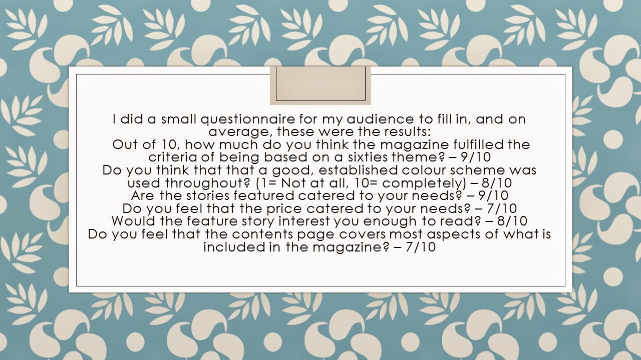
I have developed this magazine so that it looks more professional than my preliminary task, and so it appeals to my target audience more. I have done this by doing a questionnaire for my target audience to fill in after the product was finished, as seen on the evaluation question 5, as well as, before creating my product, doing a focus group so that I got to know what it was my target customer liked and didn't like, and then I reflected their needs within my product. When it came to my preliminary task, I didn't do a focus group, and in some ways I believe that this is why my preliminary product doesn't correlate to my target customer's needs as well as my magazine does.
If I were to do this product again, I would change the era in which I based my magazine on; I may still include the artists that featured on my product again, however I would definitely make it a more modern style product. This is because I found it incredibly hard to find colour schemes and fonts/colours that fitted particularly and specifically with my theme, and also when it cames to editing my pictures, I didn't know, even with planning and research, if I needed to add an effect on or not and why.
I found carrying out the preliminary task useful as I found myself understanding how each application worked and how to create my magazine; I believe that if I went straight into my music magazine without doing the preliminary task, then I wouldn not have had as much knowledge on the connotations and what an audience wants and doesn't want etc.
In order to produce my music magazine, I found that I learnt a lot about the typical connotations of a music magazine, and what an audience wants in order to buy and re buy a magazine. I also found that I learnt a lot more about the music industry, and how a music magazine is made and what research goes into it all, as well as finidng out the best ways to get a photo and in what areas etc. I found out many key definitions, like for example, what a niche audience is (a small proportion of a population that are most likely to read/listen to etc. indie products), and where to put things like a mast head, skyline, plug and why etc.
There are many things that differentiate between my two products; the preliminary task and my final front cover for my music magazine, the first being that I have learnt not to only use one text for the whole front cover, as I did for my preliminary task. This time, I have used 3 main texts along with 1 or 2 subtexts, which means that my music magazine looks more professional and more attractive towards my target audience; it does not look bland. As well as this, I have also learnt to have my feature artist looking directly at the camera, as it makes the audience feel as if they are more involved with the magazine itself, as well as making the artist look like they are involved with the magazine.
I have developed this magazine so that it looks more professional than my preliminary task, and so it appeals to my target audience more. I have done this by doing a questionnaire for my target audience to fill in after the product was finished, as seen on the evaluation question 5, as well as, before creating my product, doing a focus group so that I got to know what it was my target customer liked and didn't like, and then I reflected their needs within my product. When it came to my preliminary task, I didn't do a focus group, and in some ways I believe that this is why my preliminary product doesn't correlate to my target customer's needs as well as my magazine does.
If I were to do this product again, I would change the era in which I based my magazine on; I may still include the artists that featured on my product again, however I would definitely make it a more modern style product. This is because I found it incredibly hard to find colour schemes and fonts/colours that fitted particularly and specifically with my theme, and also when it cames to editing my pictures, I didn't know, even with planning and research, if I needed to add an effect on or not and why.
I found carrying out the preliminary task useful as I found myself understanding how each application worked and how to create my magazine; I believe that if I went straight into my music magazine without doing the preliminary task, then I wouldn not have had as much knowledge on the connotations and what an audience wants and doesn't want etc.
In order to produce my music magazine, I found that I learnt a lot about the typical connotations of a music magazine, and what an audience wants in order to buy and re buy a magazine. I also found that I learnt a lot more about the music industry, and how a music magazine is made and what research goes into it all, as well as finidng out the best ways to get a photo and in what areas etc. I found out many key definitions, like for example, what a niche audience is (a small proportion of a population that are most likely to read/listen to etc. indie products), and where to put things like a mast head, skyline, plug and why etc.